Show summary Hide summary
- When typography turns a cup into a punchline
- Viral reactions: memes, comments, and the joke everyone shared
- Why kerning and spacing matter for movie marketing
- Merch strategy around Wicked: For Good
- Practical steps designers and theaters should take
- How this hiccup matters for future movie merchandising
- Lessons for brand managers and print partners
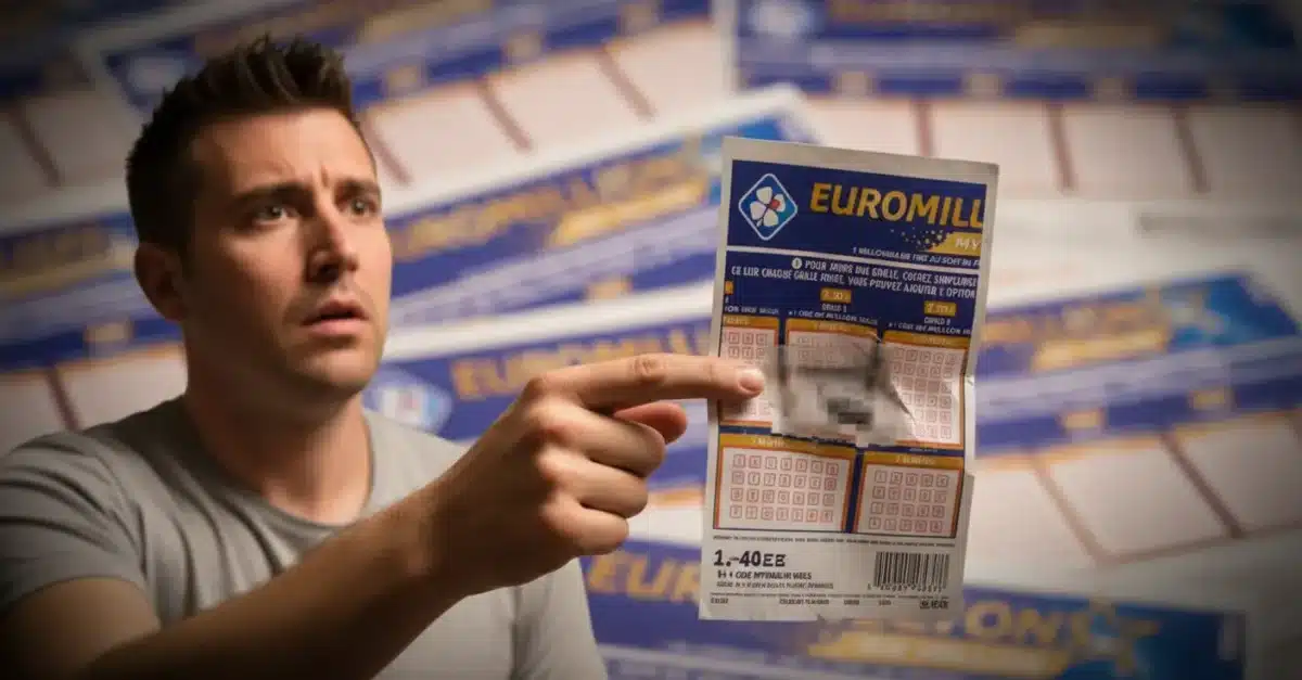
A seemingly small design choice at movie theaters has sparked a wave of amusement online. Cups promoting Wicked: For Good carry a slogan meant to read “Go on, you’re free,” but tight letter spacing turned the phrase into something very different. The misread line has theater staff and movie fans sharing photos and jokes across social platforms.
When typography turns a cup into a punchline
What looked like a harmless piece of promotional swag became a lesson in visual clarity. The words “Go” and “on” were set so close that they merge at a glance. From a distance, the phrase appears to read “Goon, you’re free.” That unintended reading is what made the cups go viral.
Anglo-Saxon burial reveals “unprecedented” secrets: experts stunned by 1,400-year-old grave mysteries
What Your Instinctive Tree Choice Reveals About Your Personality—Experts Explain
Employees at several chains posted images to a cinema-focused subreddit. Their photos show the green-and-pink Wicked cup and, in another case, a popcorn tin with similarly cramped spacing. The posts drew immediate attention because the misread phrase changes tone entirely.
Viral reactions: memes, comments, and the joke everyone shared
Social feeds filled with quips and screenshots. Many commenters laughed at the design blunder. Others marveled that such an obvious fix slipped through approval.
- Reddit users posted side-by-side photos and riffs on the wording.
- On Twitter, viewers admitted they read the phrase wrong at first.
- Theater employees added behind-the-scenes context about merchandising workflow.
Playful mockery dominated the response, but the chatter also hinted at a deeper point about quality control for licensed movie merchandise.
Why kerning and spacing matter for movie marketing
Kerning is the adjustment of space between characters. It’s a small typographic detail. Yet it affects how fast a message is understood.
- Poor kerning can change meaning or create awkward readings.
- Merchandise is often viewed from odd angles and distances.
- Packaging and cups are handled in dim light at concession stands.
Designers must account for these conditions. Fonts that look fine on a poster can become unreadable on curved drinkware. The Wicked cup example shows how a single spacing choice can undercut a campaign.
Merch strategy around Wicked: For Good
Studios and theater chains rolled out a wide array of themed items. Fans found bright pink-and-green collectibles at many venues. Popular items included:
- Commemorative cups and reusable tumblers
- Oversized popcorn buckets
- Collectible posters and limited-edition prints
- Branded apparel and accessories
These items aim to boost ticket sales and create buzz. When design missteps happen, they tend to spread faster than the intended marketing message.
Why fans buy movie merch
- They enjoy taking a piece of the experience home.
- Limited runs create urgency and social cachet.
- Colorful, Instagram-friendly items increase organic sharing.
Practical steps designers and theaters should take
Fixing kerning problems is straightforward if teams catch them early. Here are practical checks that would have prevented the Wicked cup mix-up:
- Proof designs at full production size and on curved mockups.
- Test legibility under varied lighting conditions.
- Run quick focus-group reads with staff or fans.
- Use fonts with proven readability for small surfaces.
- Ensure brand and legal approvals include legibility checks.
Simple mockups and user tests often save money and embarrassment. A fast review catches issues that slip past digital proofs.
How this hiccup matters for future movie merchandising
Merchandise teams now face higher scrutiny. Social media amplifies any flaw, and a single misprint can eclipse careful campaign planning.
For tentpole films, every piece of physical merch is both a product and a promotional signpost. When it works, the item encourages repeat views and free publicity. When it fails, it becomes a viral anecdote.
Lessons for brand managers and print partners
Beyond kerning, the incident highlights coordination needs between studios, theatrical chains, and printers. Key takeaways include:
- Establish a clear sign-off workflow that includes legibility tests.
- Ask print vendors for physical proofs before mass runs.
- Prioritize readability over decorative typography on small items.
- Document and share best practices across franchise merch teams.
Merch mistakes can be turned into teachable moments. They also create unexpected publicity, which some teams may choose to embrace.