Show summary Hide summary
- Why Pantone says Cloud Dancer matters
- Immediate social media reaction and controversy
- Is the Color of the Year racist or just unfortunate timing?
- Examples and echoes from other campaigns
- Why many critics called the pick tone‑deaf
- Lessons for brands, designers, and cultural curators
- How the debate may shape future Color of the Year picks
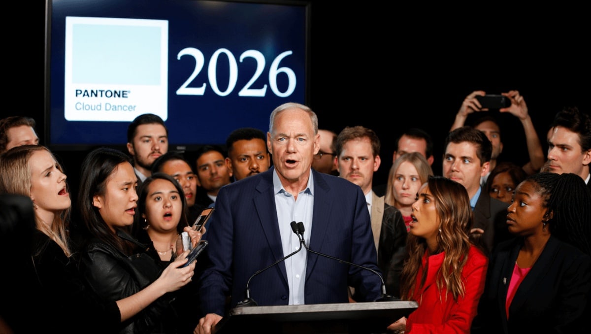
Pantone’s pick for 2026 — a soft off-white christened “Cloud Dancer” — landed with more than a few raised eyebrows. Announced in early December, the color was billed as a calming neutral. But the choice quickly sparked heated debate online about symbolism, timing, and whether a simple hue can carry political weight.
Why Pantone says Cloud Dancer matters
Pantone framed Cloud Dancer as a quiet, breathable shade meant to inspire calm and clarity in design. The Color Institute described the palette as a kind of visual pause, a neutral that invites reflection in busy spaces.
Anglo-Saxon burial reveals “unprecedented” secrets: experts stunned by 1,400-year-old grave mysteries
What Your Instinctive Tree Choice Reveals About Your Personality—Experts Explain
Pantone’s official line emphasized texture, light, and practical uses in interiors, fashion, and product design rather than political meaning.
How the institute explained its decision
- Pantone highlighted emotional qualities like calm and clarity.
- The selection was positioned as a design prompt, not a political statement.
- Institute leaders said skin tones were not considered when choosing the shade.
Immediate social media reaction and controversy
The announcement met an intense social media response within hours. Many users reacted with humor. Others read the choice as tone‑deaf given the broader political climate.
Types of reactions
- Critics argued the timing made the white tone feel politically loaded.
- Some likened the pick to provocative publicity, saying controversy boosts attention.
- Observers posted sardonic takes pointing out perceived irony in celebrating “neutral” white.
Voices across platforms questioned whether choosing an almost‑white shade during a period of heightened racial and political tensions would feel insensitive.
Is the Color of the Year racist or just unfortunate timing?
The short answer: the color itself is not inherently racist. The longer answer is about interpretation and context.
Many commentators argued the selection could not be separated from current events. Others warned that symbols can be co‑opted or misread.
What Pantone and others said in response
- Pantone representatives stressed that skin tones did not factor into the choice.
- They noted similar questions arose around prior picks like warm peaches and muted browns.
- Design leaders urged viewers to see the choice as aesthetic rather than ideological.
Still, critics said intent isn’t the only measure. They argued that brand decisions exist within a social context and can reinforce narratives, intended or not.
Examples and echoes from other campaigns
Recent marketing controversies show how imagery and wording can be read politically. An unrelated fashion campaign triggered debate about implicit messaging, reminding brands that audiences are sensitive to symbolism.
- Past campaigns have been scrutinized for dogwhistle anxieties.
- Design choices frequently spark discussion about who makes color decisions.
- Public reaction often focuses less on intent and more on effect.
Why many critics called the pick tone‑deaf
Some responses centered on the idea that choosing white right now ignores the lived reality of marginalized groups.
- People pointed out national political shifts that amplify racial tensions.
- Commenters said elevating a near‑white tone felt like poor timing.
- Others suggested the decision reflected a lack of diverse perspectives in the room.
Critics asked for greater awareness of how design decisions might appear when amplified by media and memes.
Lessons for brands, designers, and cultural curators
Whether or not Pantone intended controversy, the episode offers practical takeaways for those shaping visual culture.
- Build diverse review teams to vet choices before public release.
- Anticipate how a visual decision might be interpreted in the current political climate.
- Prepare clear messaging about creative intent to reduce misreading.
- Listen to feedback and explain the aesthetic rationale openly.
Transparency and context can reduce misunderstanding, even for seemingly neutral decisions like a color pick.
How the debate may shape future Color of the Year picks
Expect future selections to come with more narrative framing. Brands will likely foreground the cultural and emotional reasoning behind choices.
Design institutions may also take extra care to communicate process, cite diverse input, and address potential misinterpretations before rolling out global campaigns.